Charts & Graphs
Solution No. 414
OVERVIEW
Introduction
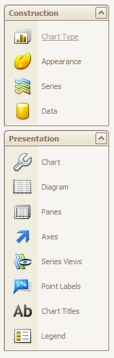
Construction
Chart type
Appearance
Series
Data
Chart
Diagram
Panes
Axes
Series view
Point labels
Chart titles
Legend
Overview
Charts are a great way to visually represent all kinds of information, from the simple to the very (very) complex. Report Designer comes equipped with a powerful wizard designed to help you build charts for your reports exactly to your specifications, giving you unparalleled control over every element of the information displayed. Whether you just need a simple pie graph showing basic percentages or a complicated polar line graph with dozens of data points, Report Designer can do it!
Since charts are built in a wizard, we are going to forego our regular step-by-step instructions in favor of a detailed breakdown of each step in the wizard, designed to help you make sense of your options and learn how to use the tools at your disposal.
back to top
Introduction
Charts can be inserted into your report simply by dragging and dropping the Chart control into a band. If you only want your chart to appear once (instead of repeated page to page) it’s a good idea to drag it into a Report Header band, which only appears on the very first page of a report. Once you drag a Chart control into a band, the wizard will appear. While you will typically make your choices on a screen and click “next” to proceed to the next screen, you can return to any screen at any time by clicking on it in the left-hand toolbar, which looks like this:
For the sake of simplicity, we will go through these options in order from top to bottom. Please note, we will be detailing only the elements of the wizard most important to Method users in the interest of making this documentation useful to you!
back to top
Construction
The Construction section of the toolbar contains the fundamentals needed to build a great chart. You will need to use certain tools from the Presentation section to really make your chart work, but the Construction section is where you will input your data and make it appear on your screen. Let’s take a look at each section in greater detail.
back to top
Chart type
This is perhaps the simplest part of the chart wizard - choosing the kind of chart you wish to create! Choosing a chart type means understanding what kind of data you want to illustrate, and the message you’re trying to get across. For example, if you want to show your company’s growth in terms of new customers over a one-year period, you might choose a line graph. However, if you want to identify your total profit from two separate years, a bar graph might work best. Click the chart type that works for you and proceed to the next step!
back to top
Appearance
This section is where you start to make some basic decisions about how your chart will look when it is displayed. The two options available on this screen are Palette and Style. The Palette refers to which colour theme will be used to represent your chart’s series and data points. By default the chosen palette is Nature Colors, but there are dozens of options available in the drop down menu. The Style refers to how those colors will be expressed in your chart (which colors will go where). The drop down menu displays previews of each style so it’s easy to choose what you like. Play around and see which one works best for you (remember you can always go back and change the appearance at any time by clicking on the Appearance icon in the tool bar).
back to top
Series
In order to understand what the Series section allows you to do, we first need to define what a series is. In short, a series refers to a group of data points on your graph that share something in common with one another.
For example: if your graph shows the highest recorded temperature each month for twelve months for Dallas, Texas, that’s a series. If you wanted to also show the highest temperatures per month in Nome, Alaska on the same graph, that would be considered a second, separate series.
Report Designer can add multiple series to the same graph, which allows you to display a wide variety of information in one place.
The Series window displays the series you have created so far. You can use the Add, Copy and Remove buttons to add a new series, copy an existing series, or remove a series altogether (this can’t be undone).
Choose whether you want this series to be visible in your graph or invisible by clicking the Visible radio button. Give your series a unique name to make it easy to locate by typing one into the Series name bar. The Series view type, by default, shows you what kind of chart you chose in the first step. This allows you to assign different chart types to different series (e.g. a bar for one, a line for another). Keep in mind not all types will be compatible for one another - but if you choose an incompatible type, Report Designer will tell you!
Series options
This part will need another quick definition. Graphs are based on two unique sets of information: arguments and values. Simply put, the argument (usually the x-axis) is something that has a numerical value associated with it, and the value (usually the y-axis) is that value expressed in numbers.
For example, if you were to create a basic bar graph showing the total balance for the month of May for ten different customers, the argument would be the customers themselves, and the value would be the dollar value of the balances.
The argument and value scale type menus allow you to choose how the series will be expressed. An argument can be expressed as a non-numerical qualitative scale (like our customer example) or as a numerical or date/time scale. A value can only be expressed as a numerical or date/time scale.
The Point sort order and Sort points by menus allow you to determine how the information will be ordered - in ascending or descending order, by argument or value.
For example, if our balance example from earlier was sorted in ascending order by value, that means the graph would start with the smallest balance and sort the data in order up to the highest balance, and rearrange the customers in turn. If, however, we were to sort the same graph in ascending order by argument, the graph would show the balances arranged by customer in alphabetical order from A-Z.
You can choose to identify your series in a legend with particular text by clicking Show in a legend and typing in the text yourself. You’ll be able to do lots more with your legend later on in the process!
Top N options
Let’s assume your graph is going to show a breakdown of countries by land mass. Now let's say you want to highlight the top five largest countries on earth (by land size), but also account for the rest of them. That’s what Top N options are for: to allow you to show only a set number of values on one end of the spectrum while giving you the option to either exclude or group the rest of the values as together as 'Other'. Enable this function by clicking the “Enabled” box, and then choose how you want to “cap” the values on your graph.
- Count: This option lets you limit your graph to the entries with the highest values, so if you have a hundred countries but only want to see the top five country land masses, you’d set Mode to Count and Count to 5.
- Threshold Value/Percent: These options work the same way. Threshold Value lets you set a cap on how high the Value scale will go: in our example from above, you might set the threshold value to 20,000 square miles, which means only five countries will appear on the graph. You can set the threshold percent the same way.
- Show others: The information excluded from your graph is placed in a section called “others”, which can be shown or hidden from the graph by clicking on Show Others. You can label this Others section by typing text into the Others argument field (for example, you might label it >8000 square miles to denote countries with a landmass lower than the threshold value you set).
Point options
These options refer directly to the data points you will include in your graph (these are the combinations of values and arguments that make up the visible information on the graph, like the points on a line graph or the tops of the bars on a bar graph). Report Designer automatically generates labels for each data point (you can do more with these labels later in the wizard), and the point options detail how those labels will appear.
- Point view: You can choose to display values, arguments, a combination of the two, or the series name in the labels using this option.
- Pattern: If you are displaying more than one thing in the label (e.g. values and arguments) you can edit the order in which they appear by moving around the bracketed letters {V} and {A}.
- Value format: This is the format in which the value will appear (e.g. currency or percent).
- Value precision: This is the number of decimal places the value will include (e.g. a value precision of 2 will display two decimal points 0.00)
Legend point options
The Legend point options section offer you the same options as the point options section, only pertaining to the legend. Generally speaking you’ll want the legend to line up with the graph, so Synchronize with point options is usually selected by default, but if for some reason you want to change them, you can do so by unclicking that option and proceeding as above.
back to top
Data
Here’s where things start to get interesting - it’s time to insert the data your graph will illustrate. The process of creating the points your graph will display is called binding, and there are three ways to do it, as shown by the three tabs on this screen. Keep in mind you will be choosing a Series from the left-hand side: all the changes you make will apply to that series alone. To add more series, please refer to the Series section above.
Points
In this section, you can add data points manually one-at-a-time by filling in the names of the individual arguments and values. For example, if you wanted to display ten customers and their associated balances, you would type in the customer name under Argument and the associated balance under Value, repeating this process all ten times. This is just fine for quick or simple graphs, but how about more complicated graphs with many data points, or data points you might not know off the top of your head? This is where our next two sections come in.
Series binding
Remember, a series is a common group of data points, and in Designer parlance that probably means they’re being drawn from the same table. Series binding allows you to bind a particular data source to a whole series at once, rather than writing down individual entries. From there you can use or create filters to decide what information specifically will be displayed.
- Choose a datasource: This is really only relevant if you are operating with several servers - the datasource is where your tables are located.
- Data member: This is where you can choose the table the series will be associated with, if it differs from the base table for the report.
- Data filters: This option pulls up a window you can use to filter the data being pulled from your table, by applying conditions to the data set. For example: if you are drawing upon CustomerBalance as a table, you can choose to omit any balance equal to Zero by setting the Condition to “Greater Than” and the value to “Zero”. This will tell Report Designer to leave out any CustomerBalance record with a value of zero or below.
The argument properties section lets you customize your argument. If you remember, the argument is the variable that has a numerical value associated with it (for example, a date or customer name).
- Argument scale type: You can choose between a qualitative argument (this is a non-numerical variable like a customer name), a numerical argument (a variable expressed in numbers like a dollar amount), or a DateTime argument (a date or time).
- Argument: This menu allows you to associate your argument with a field from the base table you chose for this report (for example, you might choose CustomerFullName if your argument is going to refer to your customers).
The value properties section lets you customize your values. If you remember, the value is the numerical variable meant to express the argument (for example, a customer’s outstanding balance).
- Value scale type: Unlike the argument, which can be qualitative in nature, the value scale can only be a numerical or DateTime value.
- Binding mode: This menu gives you the option of choosing between Values and Summary functions. Values is chosen if the field you are pulling has a single value (for example, if your Argument was Customer and your Value was Balance, that would express as a single currency amount per customer). Summary functions only applies if you are pulling a field with multiple values (for example, if your Argument was Month and your Value was Invoice balance, you might end up with several invoices in the same month, causing overlap). Summary function opens a second menu of the same name. Clicking the ellipses button [...] opens a window where you can specify a function to apply to the multiple Value. To use our earlier example, if your Argument was Month and your Value was Invoice balance, you could choose “SUM” to display only the total dollar value of all invoices in each month.
- Value: This menu allows you to associate your value with a field from the base table you chose for this report (for example, you might choose Balance if your argument was Customer).
Auto-created series
An auto-created series is best used in more complicated scenarios in which you might need to create many series to display certain information. A good example would be if you were creating a graph to display customer invoice balances by sales rep. Normally we would create a new series for each sales rep in order to display this information, but with an auto-created series we can skip that tedious work altogether and automatically create multiple series at once. For a detailed walkthrough of how this works, check out our excellent video on the topic. Below you’ll find explanations for the options you’ll see on your screen.
Series properties
- Choose a datasource: This is really only relevant if you are operating with several servers - the datasource is where your tables are located.
- Data member: This is where you can choose the table the series will be associated with, if it differs from the base table for the report.
- View type: This refers to the type of graph you intend to auto-create.
- Series: This menu allows you to define what series you will use to divide your existing series - for example, if you have a series displaying invoice balances by month, and you want to divide them further by sales rep, this is where you would choose “sales rep”. Think of it as a secondary layer you can use to further break down your information.
Sorting & Filtering
- Series sort order: You can choose to order your series by ascending or descending order (think A-Z or Z-A).
- Point sort order: Your data points can also be set to order themselves in ascending or descending order.
- Sort points by: If you choose to sort your data points in ascending or descending order, you’ll need to specify whether you are sorting by argument or value. For example, if you are viewing balances by sales rep, and you want to sort your points ascending, you can choose to sort the points alphabetically by rep (choose argument), or numerically by balance (choose value).
- Data filters: This option pulls up a window you can use to filter the data being pulled from your table, by applying conditions to the data set. For example: if you are drawing upon CustomerBalance as a table, you can choose to omit any balance equal to Zero by setting the Condition to “Greater Than” and the value to “Zero”. This will tell Report Designer to leave out any CustomerBalance record with a value of zero or below.
Argument properties
- Argument scale type: You can choose between a qualitative argument (this is a non-numerical variable like a customer name), a numerical argument (a variable expressed in numbers like a dollar amount), or a DateTime argument (a date or time).
- Argument: This menu allows you to associate your argument with a field from the base table you chose for this report (for example, you might choose CustomerFullName if your argument is going to refer to your customers).
Value properties
- Value scale type: Unlike the argument, which can be qualitative in nature, the value scale can only be a numerical or DateTime value.
- Binding mode: This menu gives you the option of choosing between Values and Summary functions. Values is chosen if the field you are pulling has a single value (for example, if your Argument was Customer and your Value was Balance, that would express as a single currency amount per customer). Summary functions only applies if you are pulling a field with multiple values (for example, if your Argument was Month and your Value was Invoice balance, you might end up with several invoices in the same month, causing overlap). Summary function opens a second menu of the same name. Clicking the ellipses button [...] opens a window where you can specify a function to apply to the multiple Value. To use our earlier example, if your Argument was Month and your Value was Invoice balance, you could choose “SUM” to display only the total dollar value of all invoices in each month.
- Value: This menu allows you to associate your value with a field from the base table you chose for this report (for example, you might choose Balance if your argument was Customer).
back to top
Chart
This section lets you customize the background of your chart with a variety of colors and effects.
Choose a background color from the drop down menu - there are dozens to choose from in the Web tab. Or, if you prefer, you can create your own color in the Custom tab (please note you may need to refer to color palette documentation you can find online to specify colors by number). There are also a variety of Windows theme colors to choose from in the System tab.
In the Fill Style section, you can choose from a number of modes: empty removes the background altogether, and solid makes the background a solid color of your choice (see above). Gradient lets you mix two colors by fading from one to the other (you can determine the direction of the fade in Gradient mode). Hatch lets you have alternating stripes of two different colors (hatch style lets you choose the direction of the hatch).
Or, if you prefer, you can upload a custom background image from your computer. Use Stretch to fit it to the screen.
back to top
Diagram
The Diagram section is where you start to be able to play with the look of your graph as a whole entity. This section is dedicated to customizing the properties of the graph, called the “diagram”, and it’s divided into three different section.
General
There are several options in this section, so let’s take a closer look at each.
- The Rotated radio button lets you rotate the graph to reverse the positions of the argument and value scales.
- The top, bottom, left and right margins can be widened or tightened using the up and down buttons for each field.
- The Pane Layout section refers to graphs with multiple panes, and allows you to change the distance between panes as well as their orientation in relation to one another. Please see the Elements section below.
Elements
This section allows you to “trick out” your graph with additional axes and panes. Adding a secondary X and Y axis will allow you to compare and contrast values and arguments (e.g. comparing the pricing of two different car models). Use the Add and Remove buttons to add or remove these axes, which you can then customize in the Axes section of the wizard.
You can also add additional Panes to your graph, which basically means you can show multiple graphs on the same page. Add and remove panes using the noted buttons, and customize them in the Panes section.
Scroll & Zoom
This is a nice simple section that allows you to enable or disable the ability to scroll and zoom in and out of your diagram while viewing your report in the Designer and in Method.
back to top
Panes
This section is used to customize the appearance of additional panes you might choose to add to your chart. Simply select a pane to be modified from the Preview screen and flip through the tabs to alter the pane’s size, coloring (same as Chart), border, and shadows.
back to top
Axes
This section of the wizard allows you to access and alter the information associated with the axes on which your data points are based. The easiest way to envision axes is in a bar graph, where the X axis refers to the horizontal (by default the argument) and the Y axis refers to the vertical (by default the value). You can change the properties of the primary and secondary X or Y axes by choosing which axis you want to deal with from the drop-down menu at the top of this screen. All the changes you make in the following section will refer strictly to that specific axis.
General
This section allows you to change the visibility, alignment and position of the selected axis. Choose whether to make the axis visible or invisible by clicking on the radio button, determine which panes you want the axis to appear in (if you’re using more than one; see Panes for more information), reverse the order of the values in the axis (for example, if your Value axis is ordered alphabetically, use this option to change the order to Z-A), and change the alignment (for example, if your value axis runs along the bottom of your grid, use this option to change it to run along the top).
Please note: There may be additional customization options available in this section, depending on what data you have chosen for this axis. For example, the most common choice that will generate more options is a DateTime variable, at which point the following options become available:
- Measure unit: This option allows you to change the tick marks along the axis to represent year, quarter, month, week, day, hour, or minute depending on the needs of your graph.
Using a DateTime variable also gives you access to another tab, called Format.
- Format: This refers to how your DateTime labels will appear in your axis. There are a number of preset options, as well as a custom option that lets you create your own format. For reference, a DateTime format might be 1/1/2014, or Jan. 1, 2014, or Jan 2014, etc.
- Format string: This is the visual description of your format (for example, MMM, yyyy = Jan 2014).
- The Range tab lets you change the settings on how far the range of the selected axis will extend. If you click Auto, the range will automatically set itself based on the values of the data points you’ve included (for example, if your highest value is 90, the range won’t extend much past that by default). Otherwise, you can set the minimum and maximum values manually, as well as the internal minimum and maximum which will dictate how much of the chart’s information will be displayed (think of it as a zoom function in which you can limit the scope of the graph to a particular window of values).
- The Scrolling Range tab lets you change settings on how far you are able to scroll within the chart itself. This is particularly useful if you have a very large graph with a larger range of information than can be visibly shown within the chart’s dimensions. As above you can choose your minimum and maximum limits, or you can click Auto to automatically set the range.
Appearance
This section allows you to change the colours and gradients associated with each axis. Change the color and thickness of the axis line with the top two controls, and if you choose, you can change the background colors by enabling “Interlace”, which will create alternating colors in the background of your chart lined up with this axis.
Choose a background color from the drop down menu - there are dozens to choose from in the Web tab. Or, if you prefer, you can create your own color in the Custom tab (please note you may need to refer to color palette documentation you can find online to specify colors by number). There are also a variety of Windows theme colors to choose from in the System tab. Choose a second color to use as your alternate.
In the Fill Style section, you can choose from a number of modes: empty removes the background altogether, and solid makes the background a solid color of your choice (see above). Gradient lets you mix two colors by fading from one to the other (you can determine the direction of the fade in Gradient mode). Hatch lets you have alternating stripes of two different colors (hatch style lets you choose the direction of the hatch).
Elements
This allows you to minutely control the appearance of your axis based on three criteria: Title, Tickmarks, and Gridlines. The options in Title allow you to customize the name of the axis (for example, a value axis might be called “Customer name”) based on text (the title you choose), alignment, color and font. The Tickmarks section lets you control the visibility, spacing, and size of the tickmarks on the axis that correspond to the value (for example, an argument axis might count up by multiples of ten). The Gridlines section allows you to insert gridlines into your chart, and control how they are expressed in terms of size, colour, etc. These gridlines correspond with your tickmarks, but you can choose to make either of these invisible.
Labels
Labels allow you to customize what information appears for each plot point along your axis. The information itself (for example, customer names) will appear based on the tables you’ve chosen to pull from, but you can edit how these labels look from here. Under the Auto tab you can make the labels visible or invisible, stagger and angle their orientation, apply antialiasing to smooth out rough edges of fonts, change the color and font of the labels, and add pre- and post-label text that will appear before or after the label (for example, “beginning text” might be “Customer name” which means that would appear ahead of every name on the axis: “Customer name Bob Crenshaw” etc.)
Strips
This is the section where you can customize the interlaced background you created before, where applicable. The “strips” are the segments of color you requested in the Appearance section. Add strips to identify the values you want to ascribe to each.
- The General section allows you to make the strips visible, add a custom label to the strip and the legend, and choose whether the labels appear in both places.
- The Limits section allows you to section off pieces of the strip based on your primary axis values, effectively changing the size of the strip to encompass certain data in your graph. For example, if you set your Min Limit to A and Max Limit to F, this means the strip will be in the background of all the selected information.
- The Appearance section lets you customize the color of individual strips just as you did in the Appearance section above. Customizing individual strips overrides the general colors you assigned the interlacing.
Constant lines
Constant lines are useful in certain types of graphs to denote a definite stop in the information you’re displaying. For example, if you created a bar graph designed to show monthly profit trends from the beginning of the year until the end of the year, you may want to include projected profits beyond the current date. You could use a constant line to illustrate the point beyond which the information becomes conjecture (beyond the current month).
- The General section is where you make the line visible and whether the line appears in the fore or background of your chart. From here you can also title the line and choose for it to appear in the legend.
- The Appearance section lets you customize the color, dash style (solid, dotted, etc.) and thickness of the constant line.
- The Title section is where you will customize the actual text on the constant line, if you want any to appear. Choose whether or not it’s visible, show it above or below the constant line, apply antialiasing to the font to smooth rough edges, add the text you want to appear on the constant line, choose its alignment relative to the axis (near or far), and alter the color and font to suit you.
Scale breaks
A scale break is a stripe drawn across the plotting area of a chart to denote a break in continuity between the high and low values on a value axis. You can use a scale break to display two distinct ranges in the same chart area. For example, imagine you were displaying the balances for five customers: the first four were 20, 40, 60, and 80 dollars, and the fifth was 1000. Obviously your graph would look pretty silly if you left it like that, because the first four values would be invisible. A scale break lets you show the upper data point of your spectrum while showing the first four in relation to one another while keeping the same scale.
- Auto: use this section to activate scale breaks (make them visible) and limit the number of breaks for this chart (this will determine how the scale is broken up).
- Custom: use this section to add or remove custom breaks, rename them, make them visible, and define where the break starts and ends (for example, starting a break at 100 and ending it at 980 would be ideal for our example above, because the values of 101-979 are removed by the break).
- Appearance: use this section to choose a visual style for your scale break (ragged, straight, waved), an outline color, and the width of the break in pixels.
back to top
Series views
The series view section allows you to fully customize the view properties of your selected series. There are a variety of options available to you on this step of the wizard, including changing the colors and shadowing, adding trend and regression lines, and including fibonacci indicators for advanced data. However, these options are not commonly used by most Report Designer users, so we’re going to move on to the next section without delving too deeply into this area.
back to top
Point labels
Point labels are labels that appear on your data points to illustrate specific values. Imagine you have a value axis that counts up 1, 2, 3 to 10, but one of your argument values is 7.56 - a label can be used at that data point to display that very specific number. The point labels section of the wizard lets you customize labels for each series in your graph.
Start by choosing a series from the drop down menu at the top. All changes you make below and in the other tabs will apply only to this series.
General
In this section you can make the labels visible or invisible, determine whether you want a value of zero to be expressed by a label, and position the label (for bar graphs this is the top or center of the bar). The text settings let you apply antialiasing to smooth out rough fonts and choose the font, size, style, and color of the label text. The Resolve Overlapping Settings applies when you have two data points so close together the labels overlap. Choosing “nothing” will disable the resolving algorithm, which means the overlap will not be fixed. Default allows you to choose the amount of indent that will be applied to the labels to manually fix overlapping. HideOverlapping will apply an algorithm to replace the labels in a random way to fix overlapping without obscuring the data.
Appearance
This section lets you change the color and border of the labels displayed in the graph.
Choose a background color from the drop down menu - there are dozens to choose from in the Web tab. Or, if you prefer, you can create your own color in the Custom tab (please note you may need to refer to color palette documentation you can find online to specify colors by number). There are also a variety of Windows theme colors to choose from in the System tab. Choose a second color to use as your alternate.
Click “visible” to display a border, and then choose their color and thickness.
In the Fill Style section, you can choose from a number of modes: empty removes the background altogether, and solid makes the background a solid color of your choice (see above). Gradient lets you mix two colors by fading from one to the other (you can determine the direction of the fade in Gradient mode). Hatch lets you have alternating stripes of two different colors (hatch style lets you choose the direction of the hatch).
Line
This section is used specifically in line graphs where you might want to show a link between data points in a physical way (like using a line!) Use this section to customize your line by dash style, thickness, line color, and length.
Shadow
In this section you can affix a shadow effect to your labels. You can customize the color and size of your shadow with the options included here.
back to top
Chart titles
As you might imagine, the Chart Titles section of the wizard allows you to title your chart within the chart pane. You can add and remove new titles in the Text tab, and in the General tab, you can customize how the title looks by changing its position in the chart and the appearance of the text.
Position
- Dock: Choose whether your title will appear at the top or bottom of the chart, or vertically against the left or right sides.
- Alignment: The names used in this option are “near”, “center” and “far”, but think about it in terms of “left align” “center align” and “right align”. It’s the same thing.
- Indent: If you’ve chosen “near” or “far” you can change the indent of your title from the left or right margins using this function.
Appearance
- Color: Change the font color of your chart title.
- Font: Change the font of your chart title.
- Antialiasing: Use this function to smooth the edges of certain fonts when they’re blown up to a larger size.
- Word wrap: When the text reaches the end of the field, instead of vanishing off the screen it will “wrap” and start a new line beneath it.
- Max lines count: This will limit the number of lines available for your chart.
back to top
Legend
All good charts and graphs have legends designed to show you what’s what when you’re looking at a visual representation of data. Much like the legend on a map, the legend on your graph will guide you to understanding the data being shown in your report. Report Designer allows you to customize your legend in a variety of ways, which we’ve broken down into the tabs as they appear in this part of the wizard.
General
Make sure your legend is visible by clicking the radio button marked “visible”.
Direction determines which direction the series will be identified in your legend, from Series 1 through to as many as you have - from top to bottom, bottom to top, right to left, or left to right. For the right-left, left-right options, you can choose to equally space each entry in the legend by clicking on the radio button.
The Alignment section lets you customize where the legend will appear vertically and horizontally: at the top or bottom (inside or outside the frame of the chart), the left or right (inside or outside), or centered in line with the vertical or horizontal axis.
The vertical and horizontal Spacing sections determines how big the box containing your legend will be - the higher the numbers, the bigger the negative space around the legend entries.
The limits section lets you set the percentage of available real estate on the chart the legend will take up.
Appearance
This section lets you customize the background of your legend with a variety of colors and effects.
Choose a background color from the drop down menu - there are dozens to choose from in the Web tab. Or, if you prefer, you can create your own color in the Custom tab (please note you may need to refer to color palette documentation you can find online to specify colors by number). There are also a variety of Windows theme colors to choose from in the System tab.
In the Fill Style section, you can choose from a number of modes: empty removes the background altogether, and solid makes the background a solid color of your choice (see above). Gradient lets you mix two colors by fading from one to the other (you can determine the direction of the fade in Gradient mode). Hatch lets you have alternating stripes of two different colors (hatch style lets you choose the direction of the hatch).
Or, if you prefer, you can upload a custom background image from your computer. Use Stretch to fit it to the screen.
Marker
This section refers to the color-coded marks in the legend that coincide with the colors on your graph. You can set these markers to visible or invisible using the “visible” radio button, and change the height and width of the markers themselves using the “width” and “height” fields.
Text
From here, change the color, font, size and style of the text that appears in your legend. You can also activate antialiasing, which will smooth out rough edges of your fonts if they’re blown up.
Border
From here, you can create a border around your legend. Click “visible” to make it appear, then choose a color and thickness.
Shadow
From here, you can create a shadow to fall behind your legend. Click “visible” to make it appear, then choose a color and size.
back to top
| Created on | Jul-10-2014 |
| Last modified by | Caleb J. on | Mar-01-2021 |