Styling
Solution No. 408
OVERVIEW
A note on page options
Appearance
Formatting
Alignment
Overview
The Styling section of this documentation is meant to give you a rundown of the basic tools you can use to make your report look great! Since there are so many different ways to manipulate the look of your report, we aren’t going to go through step-by-step breakdowns here - instead, we will identify key tools within Report Designer and how they will influence different aspects of your report.
Just a quick note on controls: when we refer to controls in Report Designer, we’re talking about any element of the screen you can drag into the various report bands - so whether it’s a field, a label, or anything else you can drag on, it’s a control! You can select multiple controls at once by holding down your mouse button and dragging across the controls you want to select. After that, any changes you make (moving, formatting) will be applied to all the controls you selected. To deselect, just click away!
Some of what you’re about to see will be familiar if you’ve dealt with word processing and spreadsheet programs in the past, but just in case you haven’t, we’re going to highlight the main elements of the workspace and describe what each section does. Let’s get started!
back to top
A note on page options
The layout of Method Report Designer allows you to freely manipulate controls within the band sections by dragging and resizing with the mouse. For reference, these sections are marked with equidistant dots that allow you to accurately line up individual controls in relation to one another and the report as a whole.
back to top
Appearance
The Appearance tool box appears on the right-hand side of your Method Report Designer screen when you select different controls. In general, there are two slightly different groups of options available, so let’s look at the most common. This first version we will look at what appears when you click on the page outside the band fields. This is what it looks like:
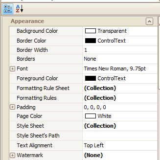
- Background color: This refers to the background color of your band sections. By default it’s set to “transparent”.
- Border color: If you wish to include borders on controls in your report, you can choose their color here. The default is ControlText, which is basically black.
- Border width: If you include borders, you can define their width as measured in pixels.
- Borders: The border function in this tool box will apply to all controls on your report simultaneously. You can choose to have a complete border (all four sides), no border at all, or any combination of the four sides.
- Font: This is a larger menu in itself, and as with the border tools, changing these settings will affect all controls in the report (that involve fonts) so let’s take a look at what it looks like:
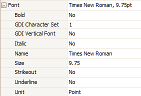
- Bold: This option bolds text.
- Italic: This option will make the text italic. Name: This is the name of the font (Times New Roman by default). You can choose other fonts from this drop down menu.
- Size: This is the size of the font (9.75 by default). You can resize from this drop down menu. Keep in mind that if the size outstrips the control’s visible face, you will have to resize the control to see the changes.
- Strikeout: This option allows you to strikeout text.
- Underline: This option will underline the text.
- Unit: This drop down menu lets you choose your preferred unit of measurement. By default the unit selected is “point” but you can also choose from millimeter, inch, and other accepted measurement methods.
- Foreground Color: This will change the color of controls in the foreground of your band sections. By default it’s set to ControlText.
- Formatting Rule Sheet: This option is covered in detail in Conditional Formatting.
- Formatting Rules: This option is covered in detail in Conditional Formatting.
- Padding: This refers to the inner margins of controls (for example, how far away from the edge of a label the text appears). You can change the amount of padding in every control box using this field.
- Page Color: This dictates the color of the actual page on which your report is printed.
- Style Sheet: You can use this option to create a mini layout template (called a style sheet) that you can call upon in order to apply multiple style changes at once.
- Style Sheet’s Path: This is where your style sheets are saved on your computer.
- Text Alignment: This will determine the alignment of text within writable controls. You can choose between top left, bottom right, etc.
- Watermark: This menu offers formatting options for including a watermark on your report. Clicking on the ellipses button [...] next to Watermark will open a popup that allows you to choose between Text and Image watermarks, which offers the options also listed below. To keep things simple, let’s take a look at the options available from the main screen.
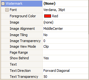
- Font: This dictates the font and size of any text associated with the watermark.
- Foreground Color: This will determine the color of any text used in the watermark.
- Image: This option lets you upload an existing image to use in the watermark, or to use one already saved in your Report Designer.
- Image Alignment: This lets you align your image the way you want (top center, middle left, etc.)
- Image Tiling: If you want your image to be tiled (repeated over and over) on your watermark, you can use this option to do so.
- Image Transparency: Set the transparency of the image to the desired level with this tool.
- Image View Mode: Choose between Clip, Stretch and Zoom to alter the way the image appears in your report.
- Page Range: Do you want your watermark only on the first page, or on the first five, or on all of them? You can change those settings here.
- Text: Here is where you can enter and edit text for a Text Watermark.
- Text Direction: Choose your text direction: horizontal, vertical, backwards or forwards diagonal.
- Text Transparency: Set the transparency of the text to the desired level with this tool.
And here is the second version of the Appearance toolbox, which appears when you click inside the band fields:
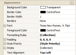
As you can see, it’s almost exactly the same, with a few minor differences. Let’s address those here.
- Style priority: This nested list gives you the option to turn on and off the following style functions:
- Background Color
- Border Width
- Border Color
- Borders
- Font
- Foreground Color
- Padding
- Text
- Text Alignment
All of these are turned on and off by selecting “yes” or “no” next to them.
back to top
Formatting
Below you’ll see a toolbar dedicated to formatting. If you’ve ever used a word processing program before, you’ll recognize a lot of these buttons, but on the off chance you haven’t, let’s go through them one by one!
- Font: Use this drop down menu to change the font of the selected text.
- Size: Use this drop down menu to change the size of the selected text.
- Bold: This button bolds the selected text.
- Italic: This button italicizes the selected text.
- Underline: This button underlines the selected text.
- Text color: This button changes the color of the selected text.
- Text highlight: This button will allow you to “highlight” selected text with the color of your choice.
- Left align: This button will align the selected text against the left margin.
- Middle align: This button will center the selected text in the control field.
- Right align: This button will align the selected text against the right margin.
- Justify: This button will evenly space each line of text between both margins.
back to top
Alignment
Below you’ll see a toolbar dedicated to alignment. We’re going to go through each button individually so you know what each button does. They’ll be numbered 1-23 from left to right, so follow along!

- To grid: This will align all the selected controls with the grid underlay.
- Lefts: This will left-align the selected controls.
- Centers: This will center the selected controls.
- Rights: This will right-align the selected controls.
- Tops: This will rearrange all selected controls so their tops are aligned with the lowest control in the band.
- Middles: This will rearrange all selected controls so the mid-point of each are aligned with the lowest control in the band.
- Bottoms: This will rearrange all selected controls so their bottoms are aligned with the lowest control in the band.
- Width: This will normalize the width of all selected controls, ensuring they are equally as wide as the largest control.
- Size to grid: This will rearrange all selected controls so they all align with the bottom of the band.
- Height: This will normalize the height of all selected controls, ensuring they are equally as tall as the smallest control.
- Both: This will normalize all dimensions of all selected controls, ensuring they are equally as large as the largest control.
- Make equal: This option works for three or more controls, and ensures all selected controls are equidistant to one another by averaging out the horizontal distance between all three and finding the median.
- Increase: This option increases the horizontal distance between two controls by one grid point per click, using the left-most control as an anchor.
- Decrease: This option decreases the horizontal distance between two controls by one grid point per click, using the left-most control as an anchor.
- Remove: This option removes the horizontal distance between two controls entirely, using the left-most control as an anchor.
- Make equal: This option works for three or more controls, and ensures all selected controls are equidistant to one another by averaging out the vertical distance between all three and finding the median.
- Increase: This option increases the vertical distance between two controls by one grid point per click, using the top-most control as an anchor.
- Decrease: This option decreases the vertical distance between two controls by one grid point per click, using the top-most control as an anchor.
- Remove: This option removes the vertical distance between two controls entirely, using the top-most control as an anchor.
- Horizontally: This will horizontally center all selected controls within a band.
- Vertically: This will vertically center all selected controls within a band.
- Bring to front: This will move the selected control in front of any other controls that may be obscuring or covering it.
- Bring to back: This will push the selected control behind any other controls that may be behind it.
back to top
| Created on | Jul-10-2014 |
| Last modified on | Feb-10-2016 |