Pivot grids
Solution No. 415
OVERVIEW
How to create a pivot grid
How to style a pivot grid
Styling individual cells
Printing settings
Organizing the pivot grid
Adding a field to the pivot grid
Conclusion
Overview
In general terms, a pivot grid is a data summarization tool used in Method Report Designer to automatically sort, count totals, or give the average of the data stored in one table or spreadsheet, then show the summarized or grouped data in a second table (called a "pivot table"). The best way to think about this in layman’s terms is this: a pivot grid in Report Designer works the same way a spreadsheet works in programs like Excel in that you can plug in parameters and data and all the calculations are done for you. This can be extremely helpful when you are trying to graphically show a large volume of complicated numbers and you don’t have the time to tally up the numbers by hand. There are a lot of complicated things you can do with this tool in Report Designer, so instead of bogging you down with a lot of technical information, we’re going to walk through building and customizing a basic pivot grid in a way that most Method users would find useful.
back to top
How to create a pivot grid
Pivot grids rely on three separate elements in order to function:
- Data: this is the information you wish to display.
- Columns and rows: these two criteria are used to determine how the data is displayed.
For our example, we will be building a pivot grid displaying the balance amounts of invoices by customer per month, as well as the grand totals of those balances, per customer and per month. To give you a better idea of what this might look like, here’s a visual from Errol’s example video:
[pivot grid example]
- To begin, create a basic report with a report header using the base table Invoice (please see our documentation on Creating a new report to learn how to do that if you haven’t already).
- Click and drag a Pivot Grid from the left-hand toolbox into your Report Header band. Note: do not put your pivot grid in the detail band.
- Click the arrow button to open Pivot Grid Tasks.
- Set data source and data member (you can learn more about data sources in our Charts documentation, but usually you’ll only have access to a single source anyway). Selecting the data source will automatically set the data member to the base table you chose when you were creating the report (in this case, Invoice).
- Click Run Designer to open the pivot grid wizard. This is where you will add the fields you want to display in the finished grid.
- Next to Retrieve fields, click the double arrow >> to display all the possible fields you can include. We will be choosing three fields, to account for Row, Column, and Data.
- Scroll through the field menu and double click on Customer, Amount, and Transaction Date. This will allow the pivot grid wizard to access the information in those fields to populate your grid, but we still need to set their parameters to determine how this will be done.
- Clicking on each field in sequence under PivotGridFields, where they appeared when you double clicked them in the list, will display the options for each on the right-hand side. Since the invoice Amount is the information we want to display, we will set it to Data by clicking on Behavior > Area > Data Area.
| TIP: |
You can access each field from the main design screen by clicking on the relevant field. This will open the editing options in the lower right-hand corner of the design screen, rather than opening the wizard. |
- Set the Customer field to Row by clicking on Behavior > Area > Row Area, and the Transaction Date field to Column by clicking on Behavior > Area > Column Area.
- By default, your transaction dates will be shown for every single day, which may not be what you want (it certainly isn’t what we want for this example!). Change the transaction date display to a monthly breakdown by clicking on Behavior > Grouping Interval > Month. Note you can choose a variety of different options from this list including Quarter, Year, and even Solstice.
- You may notice (by previewing the grid) that it isn’t all on one page. This is not uncommon depending on the data you’re displaying, but it is relatively simple to resize. Simply click on Transaction Date (our Column field) in the wizard or from the design screen, then scroll down and click on Layout > Width and shorten the width value (for this example, 70 works well). This will make the columns thinner, allowing you to fit everything on one page.
- Previewing the grid at this point will display the invoice amounts per customer per month, with totals for each month at the bottom of the month column and totals for each customer on the far-right side. A total of all customer invoice balances for all twelve months is displayed in the lower right-hand corner of the grid. These calculations are done automatically once you allow the Report Designer access to the fields, which is what the steps leading up to this one have accomplished.
- By following the steps above you’ll have succeeded in creating a simple (if not particularly attractive) pivot grid that does exactly what it’s supposed to do: display and tally the information you’ve requested. In the next section we’ll look at how to style the grid to make it look a little more interesting.
back to top
How to style a pivot grid
Now that you have a functional pivot grid in place, let’s take a look at some of the options we have when it comes to changing colours, layout, and more.
back to top
Styling individual cells
- From the pivot grid wizard, take a look at the left-hand side of the screen. Clicking on Appearance under Printing opens the Appearance editor, where you will see a list of different elements of the grid you can edit. First, let’s edit the Grand Total cells (the cells that display the grand total of all invoice balances per month, and per customer).
- From the cell list click on FieldValueGrandTotal and assign it a Back color (which will fill the cell in the background). You’ll notice you have the option in this screen to change the color of borders and also change the formatting and color of fonts. You can do this if you want to, but for now we will simply change the Back color to green.
- Then, select GrandTotalCell and do the same thing (choose a different color; we chose light green). Clicking preview will show you something like this:
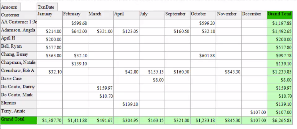
- As you can see, the FieldValueGrandTotal referred to the individual cells labeled Grand Total, whereas the GrandTotalCell refers to each cell that displays a grand total of a column or row. Looks great!
back to top
Printing settings
These settings allow you to choose which elements of the screen will and will not be displayed, including headers and lines. For example, there is a header in our existing example grid that simply reads Amount. This is a redundant header, so we can use printing settings to get rid of it.
- Click on Printing settings to bring up the editor.
- Click on Data Headers, and from the drop down menu, choose “false”. This means that header will be rendered invisible. This can be done with any header on your grid: just remember, True means “visible” and False means “invisible”. This applies to lines as well - marking horizontal or vertical lines as False will make them disappear from the grid altogether.
- Click preview to view your changes. The Amount header should be gone!
back to top
Organizing the pivot grid
From the pivot grid editor, click on Layout. From this section, you will be able to manually move elements of your grid around to change the way it’s organized. For example, if you wanted to switch the values for Row and Column (in our example, to switch the layout of Customer and Transaction Date), you can simply click and hold Customer and drag it up next to Transaction Date, then click and drag Transaction Date down to where Customer used to be. Then click “apply”. Previewing this change will show you that Transaction Date is now the vertical value and Customer is horizontal!
back to top
Adding a field to the pivot grid
What happens if you’d like to add another value to the pivot grid in the form of another row or column? It’s pretty simple and can be very helpful. For our example we will assume you also want to display Sales representatives in your grid.
- Return to the editor and double click on FieldSalesRep in the fields menu.
- Under Behavior > Area, click Row.
- Closing this window and checking the preview screen will show you something like this:
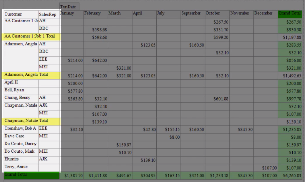
- As you can see, the grid has automatically grouped all your sales reps by customer, including a subtotal for each customer by month.
- If you wanted to change the grid again to group by sales rep (so all customers associated with each rep are grouped with them), you can do so by returning to the Layout screen and manually dragging Sales Rep to the left of Customer in the Row section, then clicking Apply. This will not only change your grid so customers are grouped by sales reps, it will also recalculate all the subtotals automatically!
back to top
Conclusion
This is by NO MEANS a comprehensive guide to all the things you can do to create and style pivot grids, but we hope it is a useful primer that will allow you to delve more deeply into the many, many options available to you on your own. If you have specific questions about functionality, our Forums are a great place to ask for help.
back to top
| Created on | Jul-14-2014 |
| Last modified by | Caleb J. on | Mar-01-2021 |